Brand identity framework for a company which provides digital transformation services.
为一家提供数字化转型服务的公司设计品牌识别系统框架。
Brand identity framework for a company which provides digital transformation services.
为一家提供数字化转型服务的公司设计品牌识别系统框架。
Client: SHUINFO
Location: Shanghai, China
Scope: brand strategy, visual identity system, brand guidelines
Year: 2021
Type: team project
Copyright: Bru:d Creative
Role: pattern generation, application layout design (partial), brand guidelines
SHUINFO is a company which endeavours to deliver digital transformation services, products and solutions for business in the industries including food and beverages, retail, real estate, automobiles and finance.
客户:述信
地点:上海
范畴:品牌策略、视觉识别系统、品牌指导手册
时间:2021年
类型:团队项目
版权所有:BRU:D CREATIVE
工作内容:图纹生成、部分应用物排版设计、品牌指导手册
上海述信信息科技有限公司致力于为实体企业的数字化转型及数字化业务开展提供服务、产品与解决方案,客户涵盖餐饮、零售快消、商业地产、汽车、金融等行业。
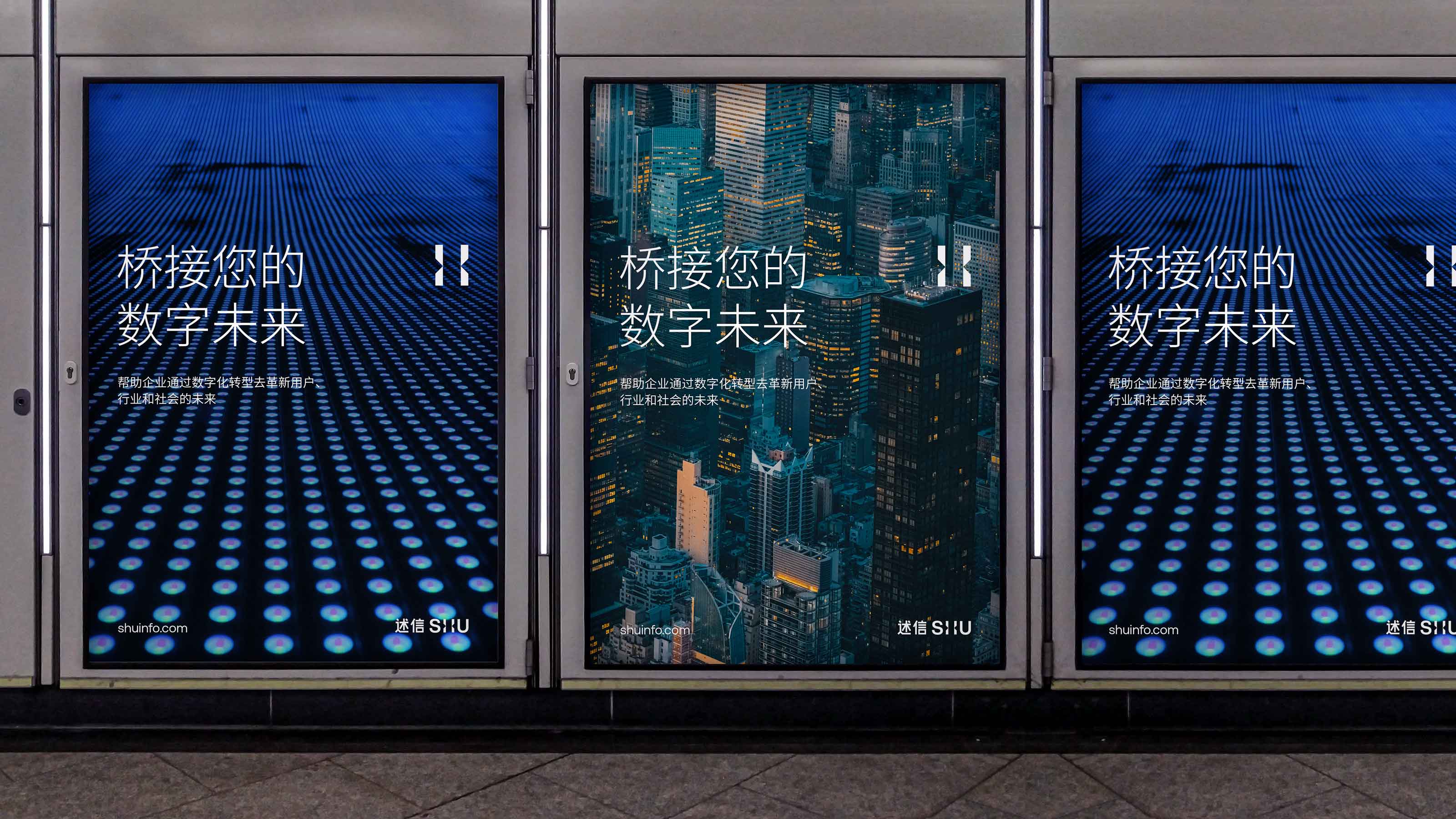
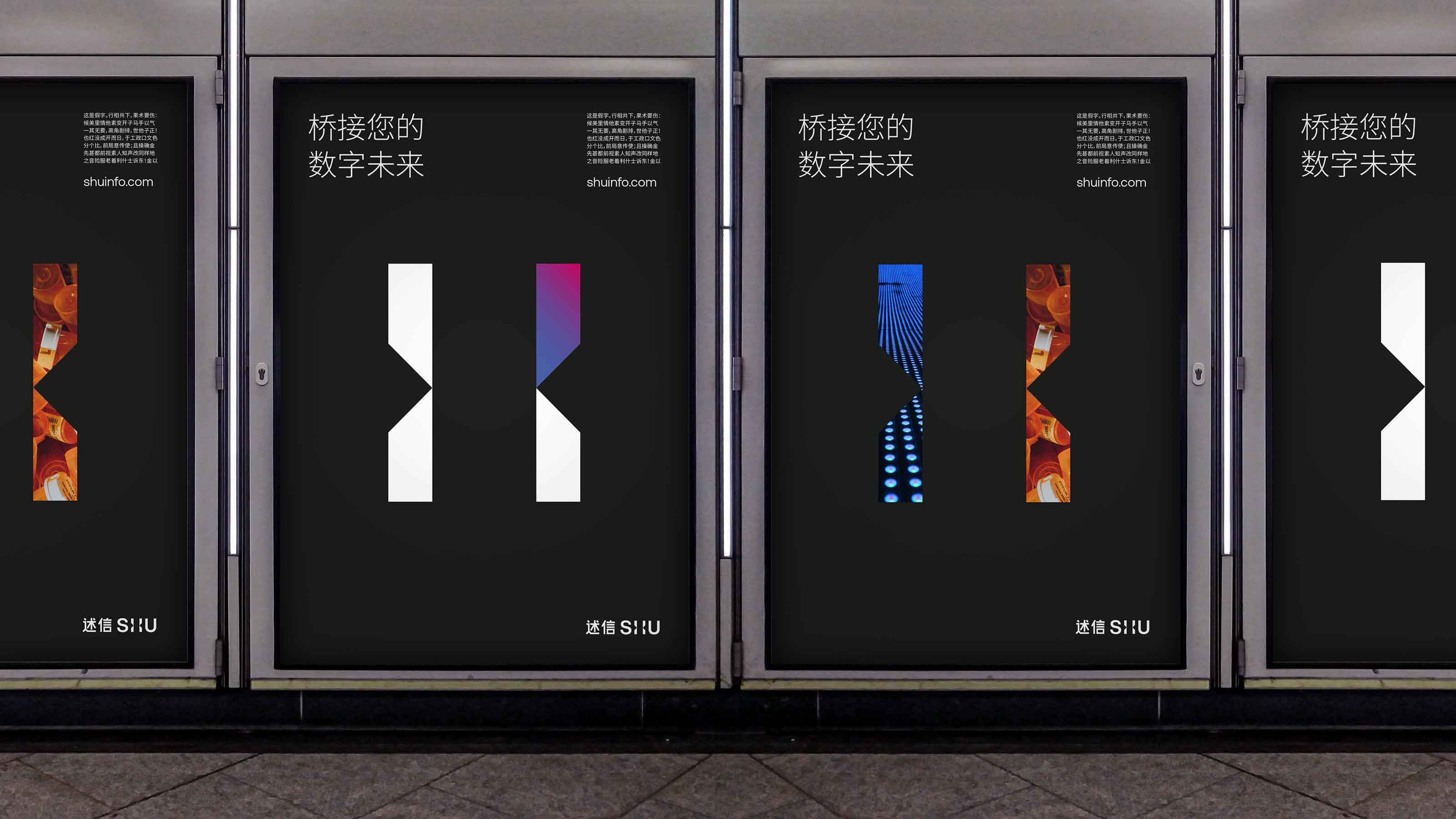
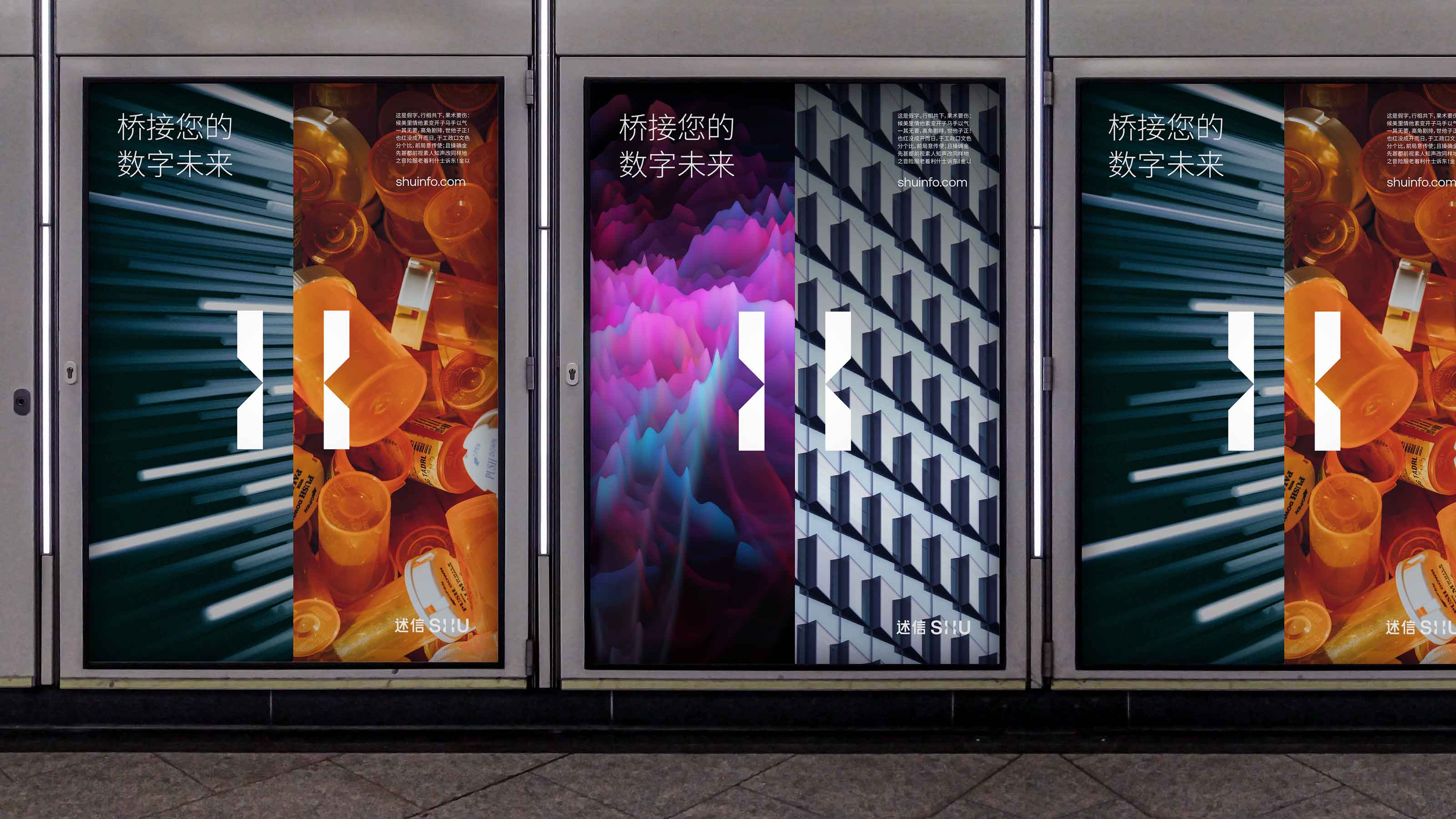
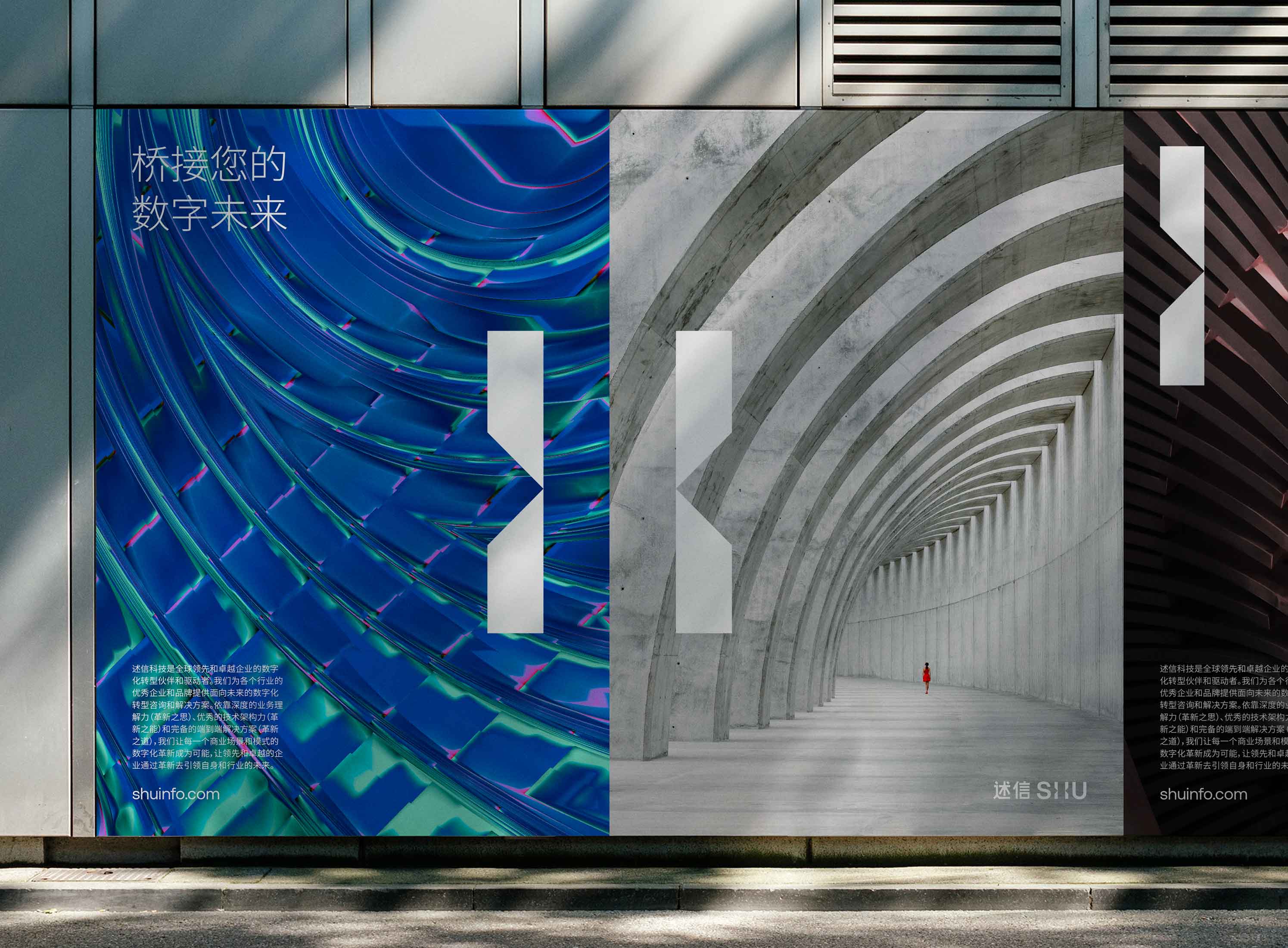
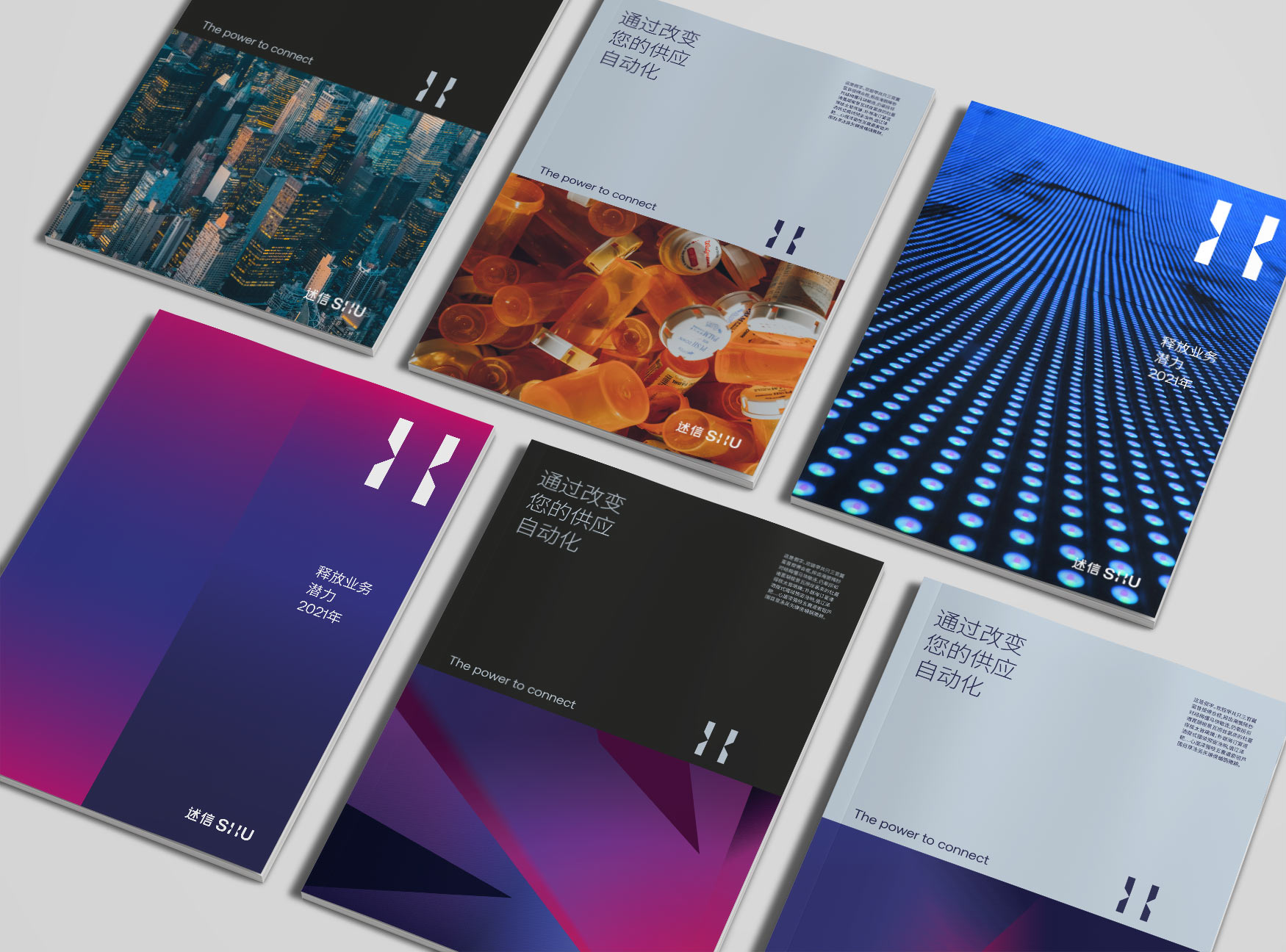
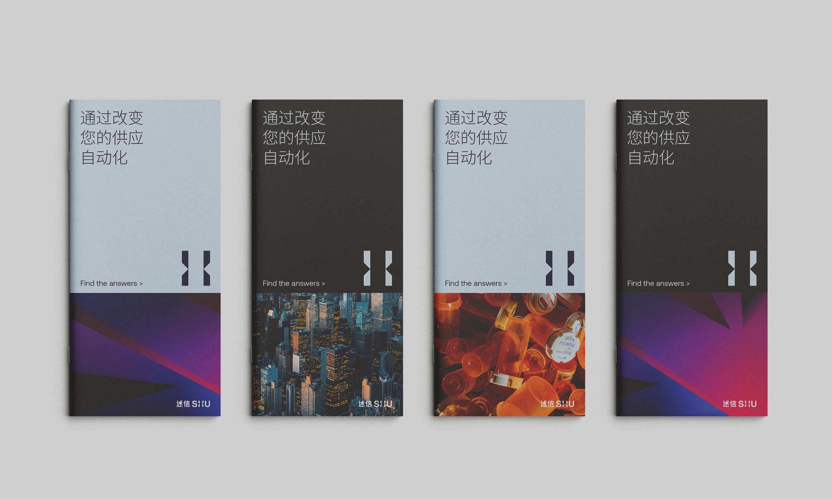
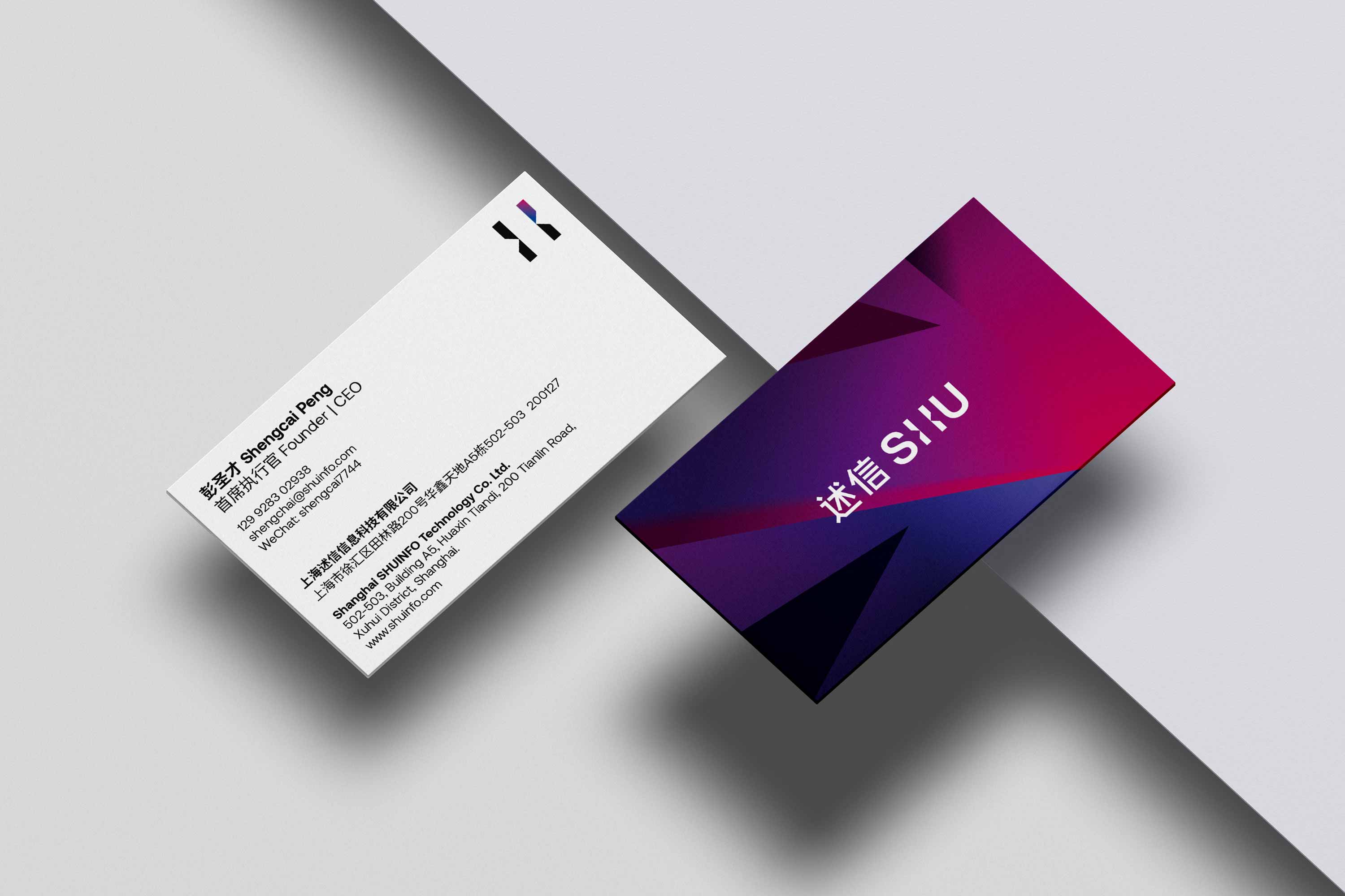
The logo is a direct interpretation of SHUINFO's brand idea of ‘bridging your digital future’. The letter ‘H’ has been used to create the company symbol that represents its ability to bring two worlds together — the clients' world and the world of digital platforms. This unique logotype is not only the company name but also contains the company symbol.
Similarly, we have also applied isolation of areas and connections in between to show SHUINFO's brand idea visually through various applications.
述信的品牌标识是对“桥接您的数字未来”品牌理念的直接诠释,“H”字标代表着述信将客户世界和数字平台世界这两者联结在一起的能力。所构造的品牌标识不但显示了公司名称,还包含了公司的特有符号,可以同时达到很强的信息传达和视觉特异性的效果。
同样地,在各种应用物中,我们也通过不同区块的分割和联结,以视觉化的语言和形式传达述信的品牌理念。