Tweaks on the visual assets of a startup electric car company to inject vibrance.
新兴电动汽车品牌拜腾的视觉资产年轻化调整。
Byton
拜腾
Tweaks on the visual assets of a startup electric car company to inject vibrance.
新兴电动汽车品牌拜腾的视觉资产年轻化调整。
Client: Byton
Location: Nanjing, Jiangsu, China
Scope: visual identity system, brand guidelines
Year: 2019
Type: team project
Copyright: Bru:d Creative
Role: poster design, brand guidelines
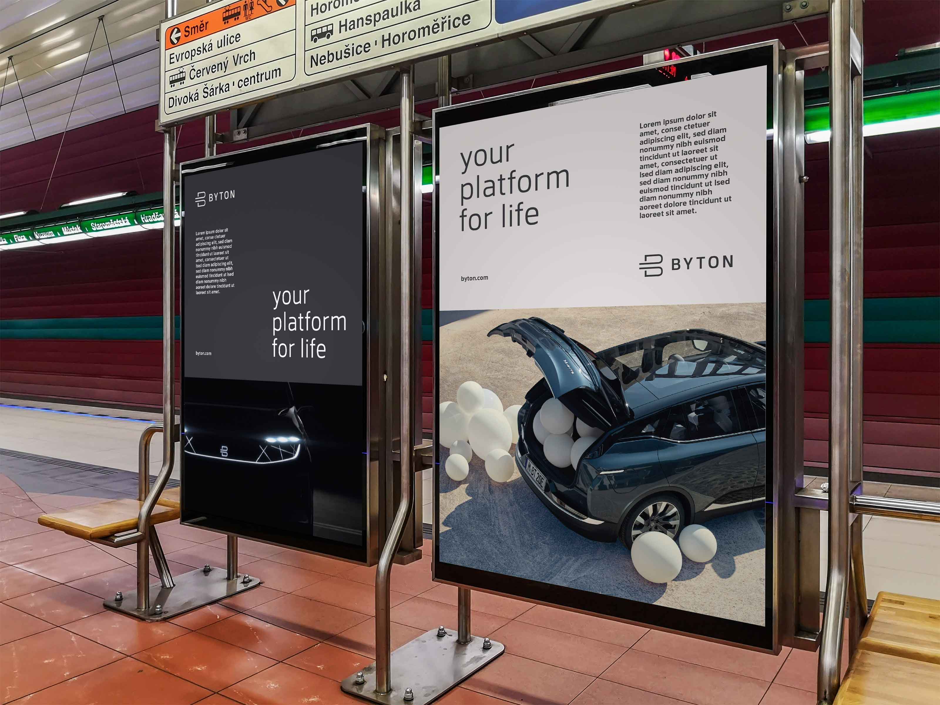
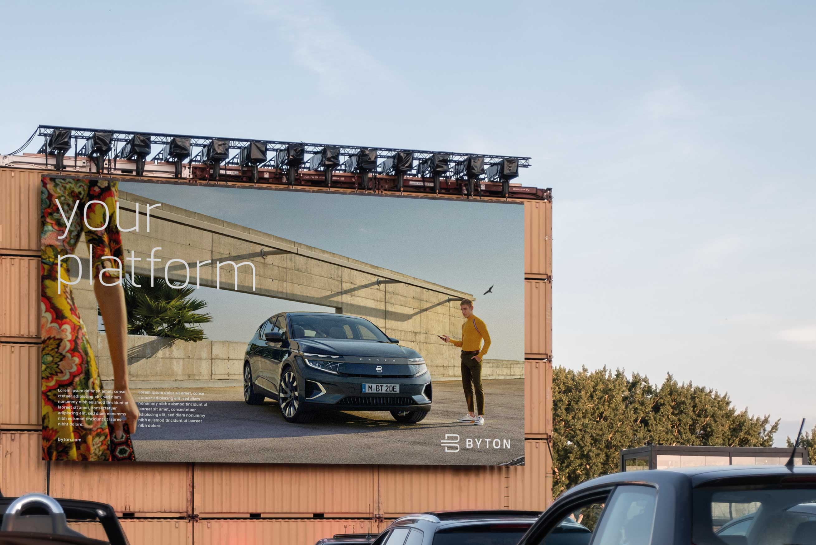
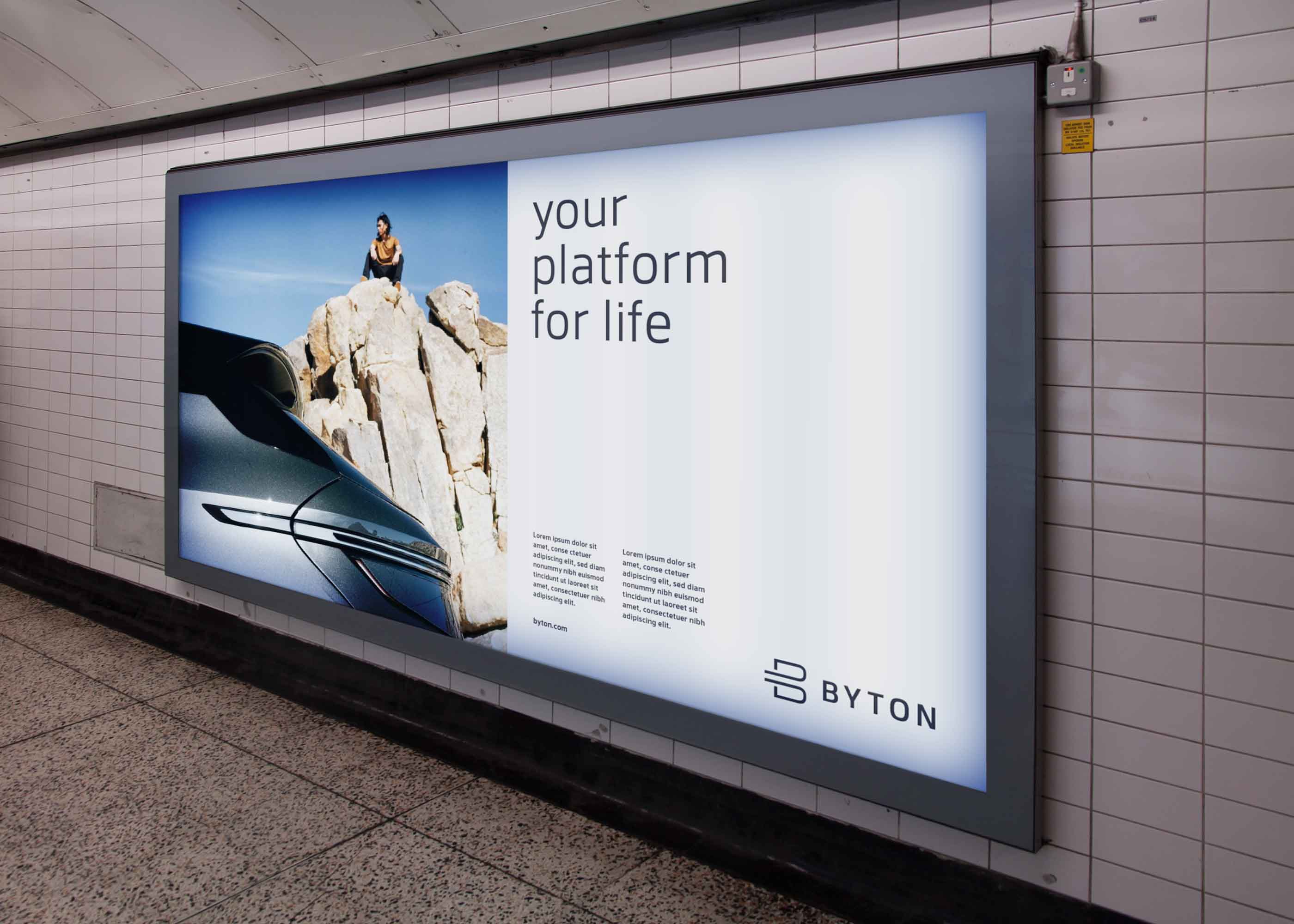
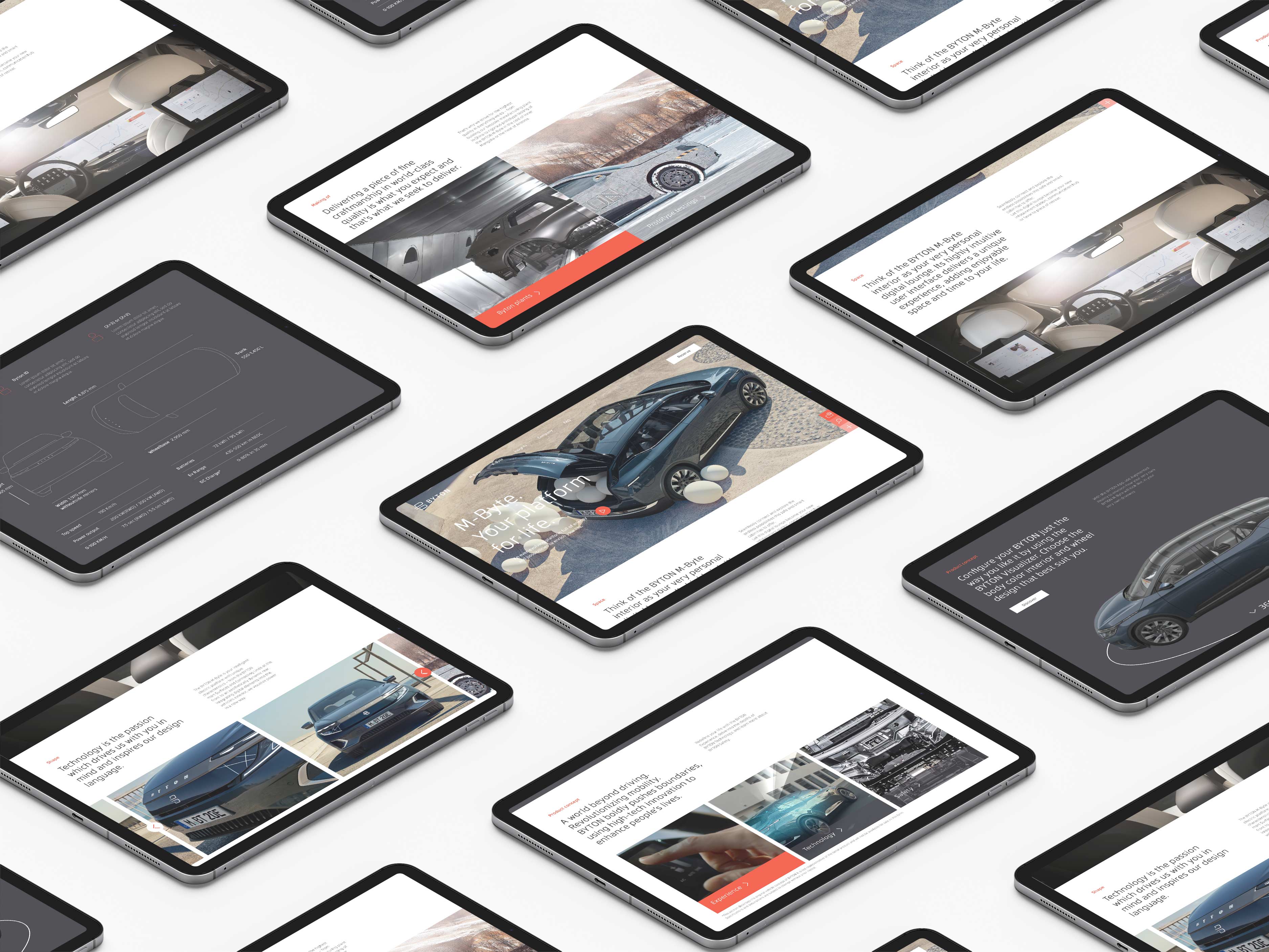
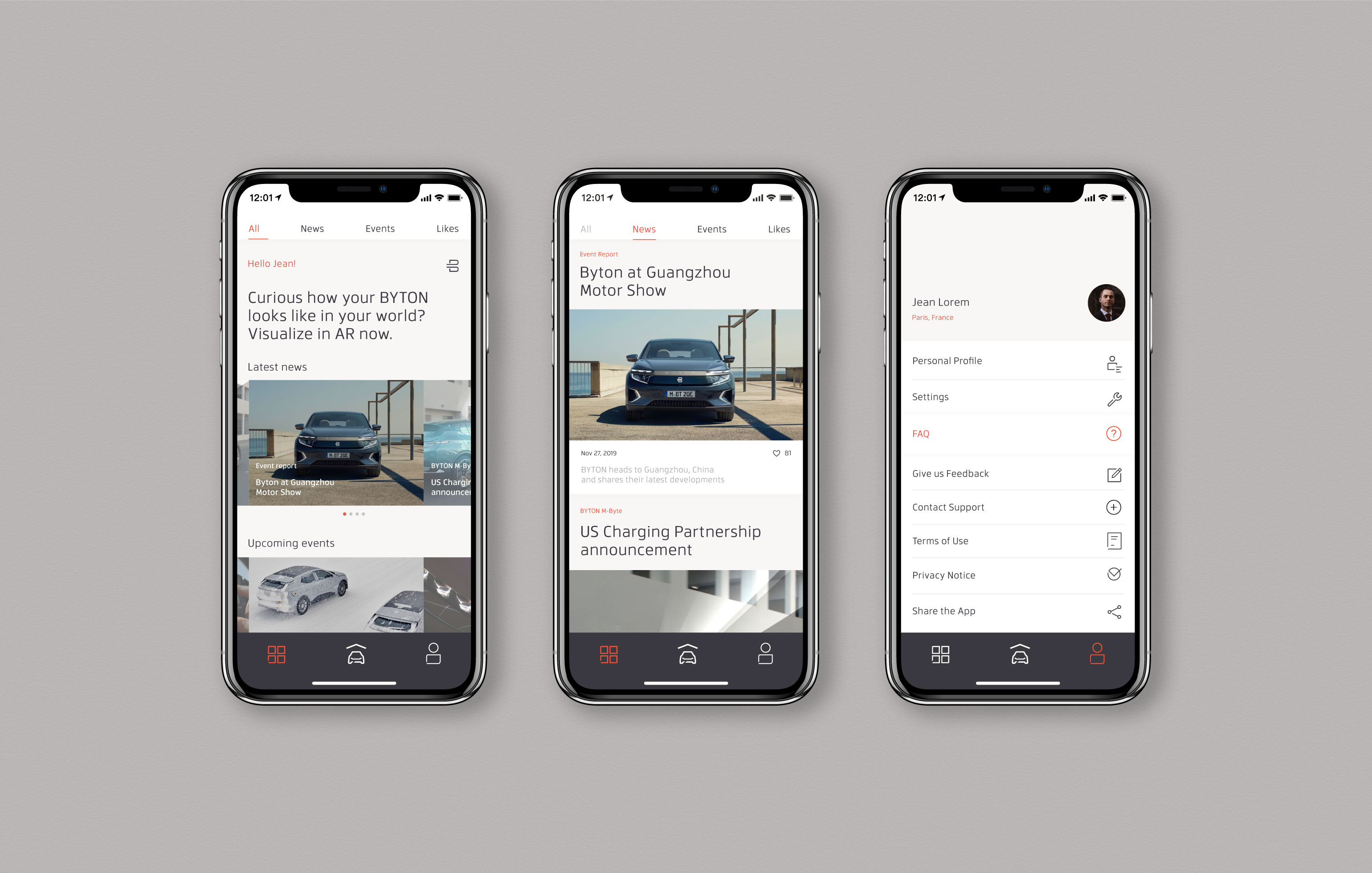
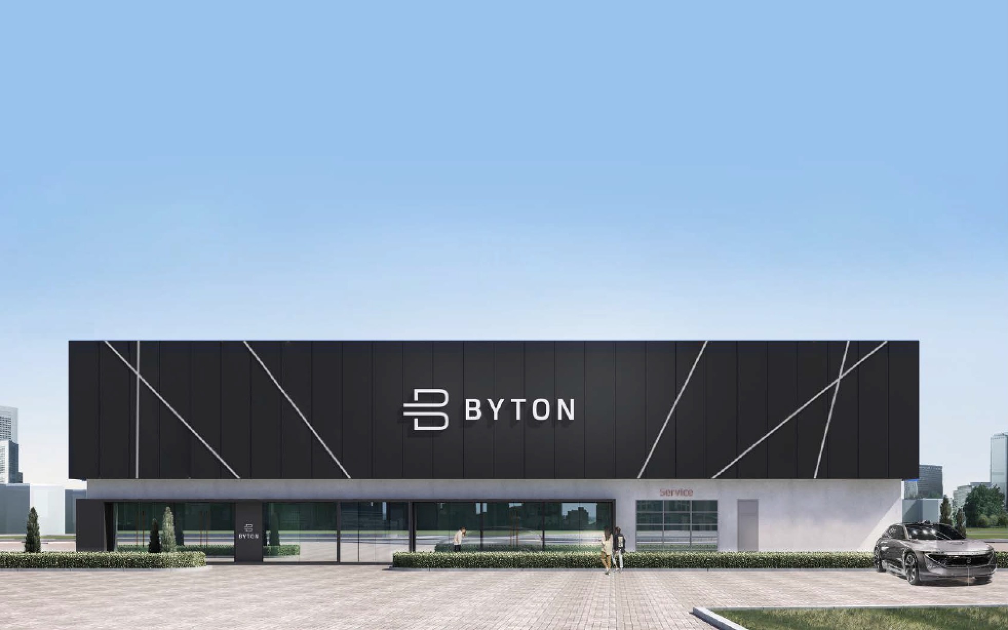
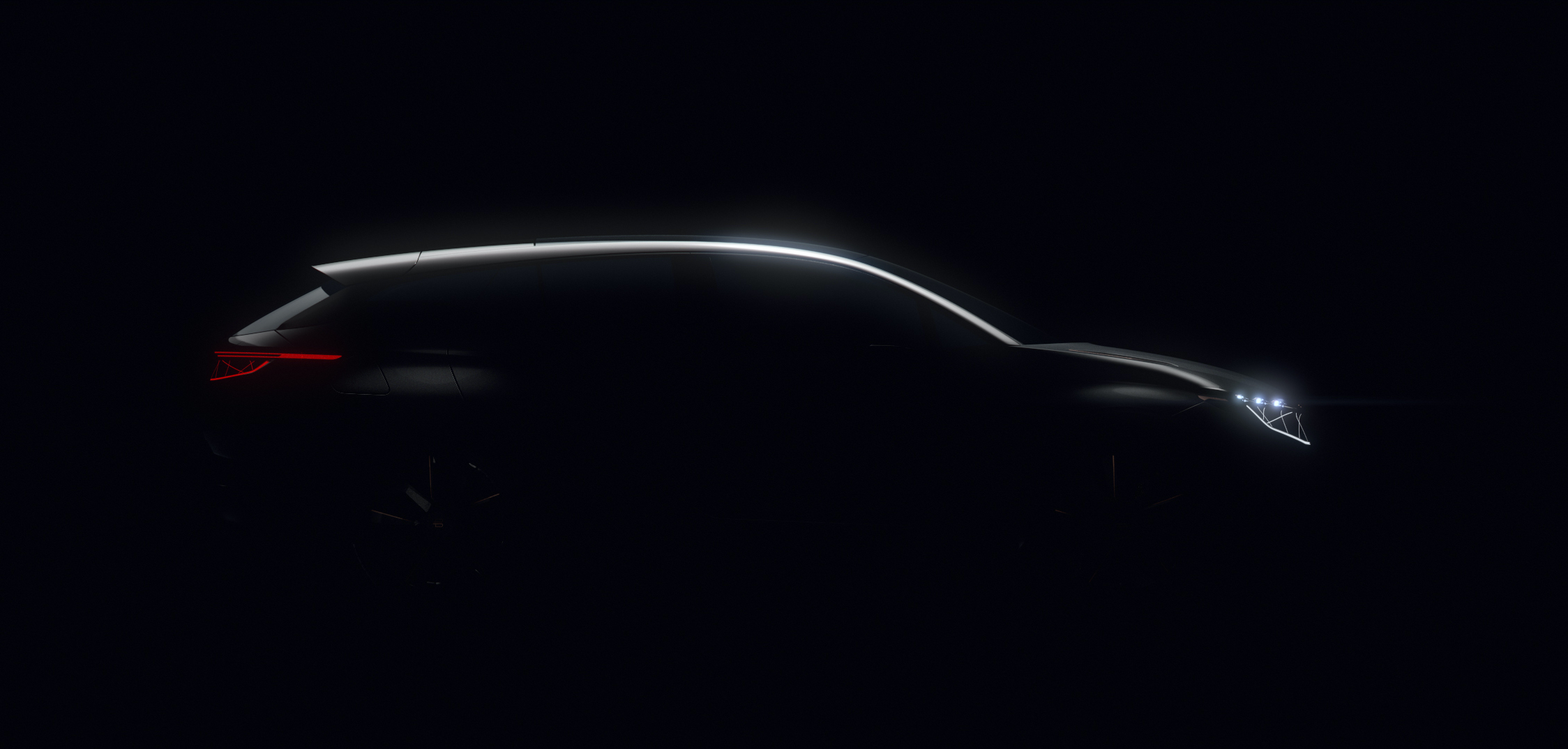
Byton is a an all-electric automotive brand established in 2017 and co-founded by former BMW and Nissan Motor executives. Their ambition goes beyond basic mobility, and is to create the next-generation smart device on wheels to seamlessly connect customer's digital life and make their time on the move more enjoyable.
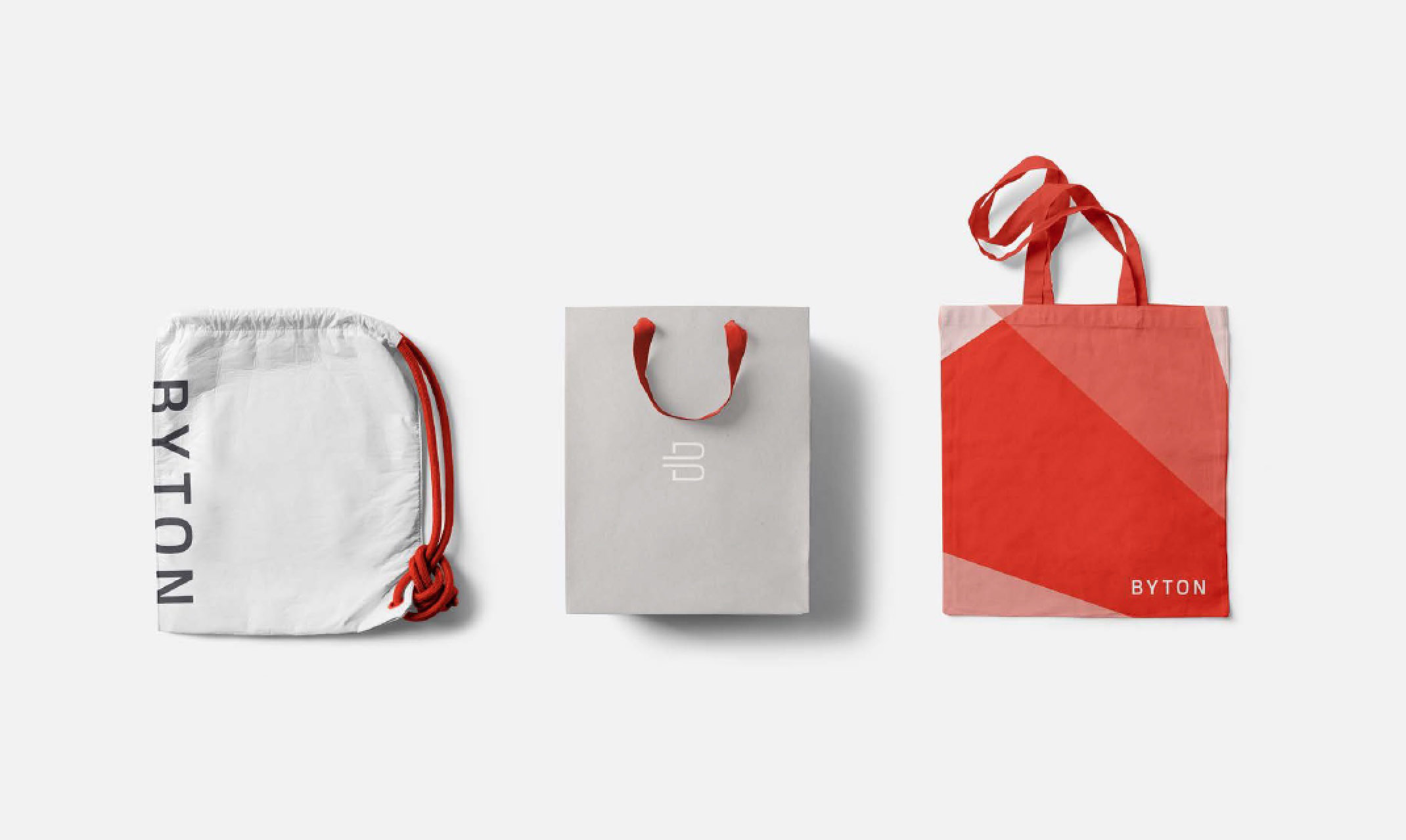
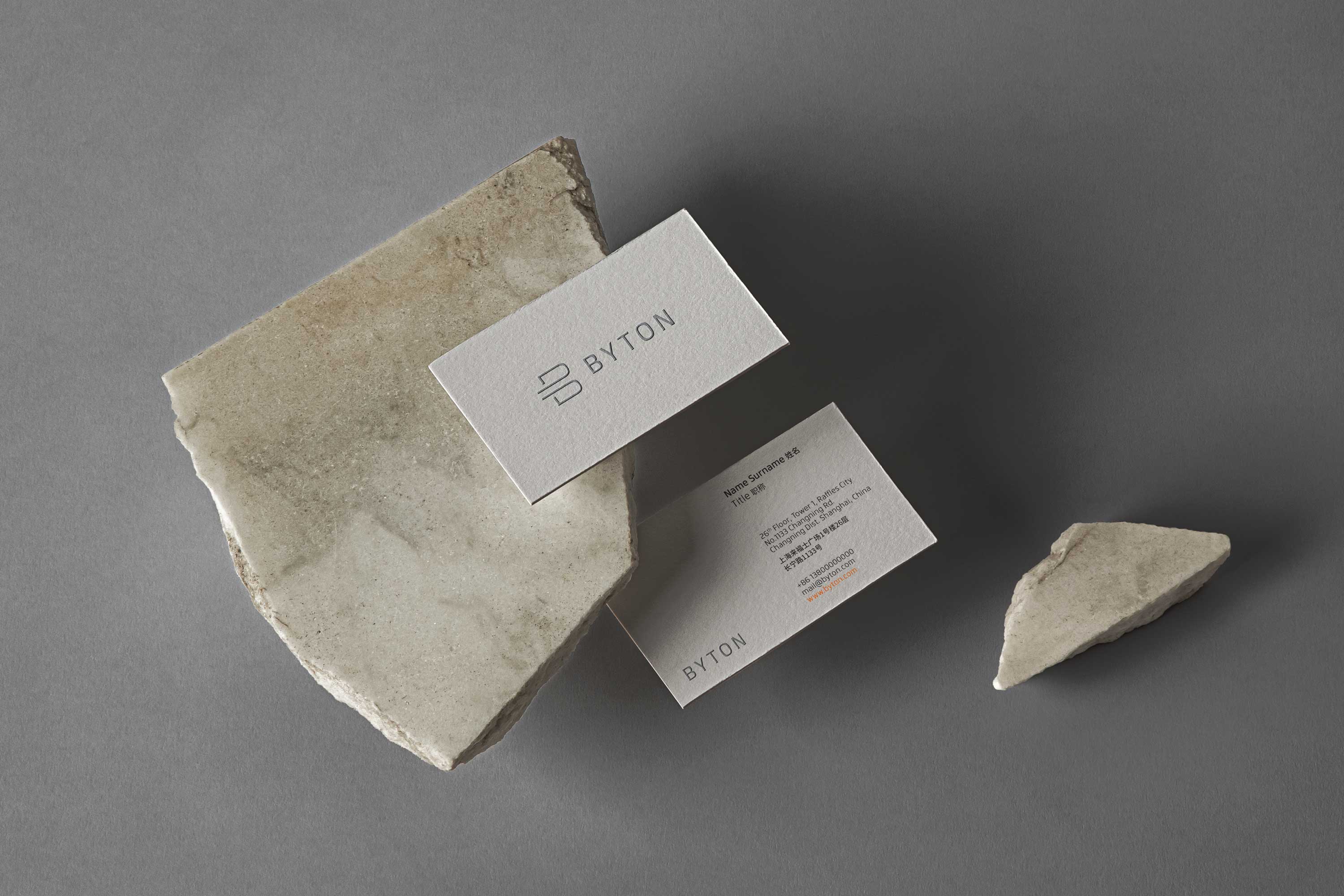
Prior to the launch of their first vehicle the M-Byte SUV, they wanted an upgrade of their identity system to better express the vision. This involved a comprehensive audit of all their existing touch points, defining opportunities to express the brand and remodelling of the key graphics, tone of voice, layout principles and photography styles.
客户:拜腾
地点:江苏南京
范畴:视觉识别系统、品牌指导手册
时间:2019年
类型:团队项目
版权所有:BRU:D CREATIVE
工作内容:海报排版设计、品牌指导手册
电动汽车品牌拜腾于2017年由前宝马和日产汽车高管共同创立。其愿景并非仅局限于汽车的基本运动性能方面,还在于创造能够无缝联结用户数字生活的智能设备,使人能够更好地享受旅途中的时光。
在正式推出首款汽车M-Byte SUV之前,拜腾希望对其现有的视觉识别系统进行升级以更好地表达其愿景,并使其更加趋向年轻化的市场和人群。这涉及对现有接触点的全面审核,以及对关键图形、调性、排版布局原则和摄影风格的重塑。