Brand identity framework for a global technology research powerhouse.
全球领先的技术研究机构Omdia的品牌识别系统框架。
Omdia
Omdia
Brand identity framework for a global technology research powerhouse.
全球领先的技术研究机构Omdia的品牌识别系统框架。
Client: Omdia (Informa Group)
Location: London, UK
Scope: consumer research, brand strategy, naming, visual identity system, brand guidelines
Year: 2021
Type: team project
Copyright: Bru:d Creative
Role: designer
Award: Gold at Transform Awards (London, 2021)
Established in 2019, Omdia is the new global technology research powerhouse which combines the expertise of more than 400 analysts covering 150 markets and thousands of technology, media and telecommunications companies.
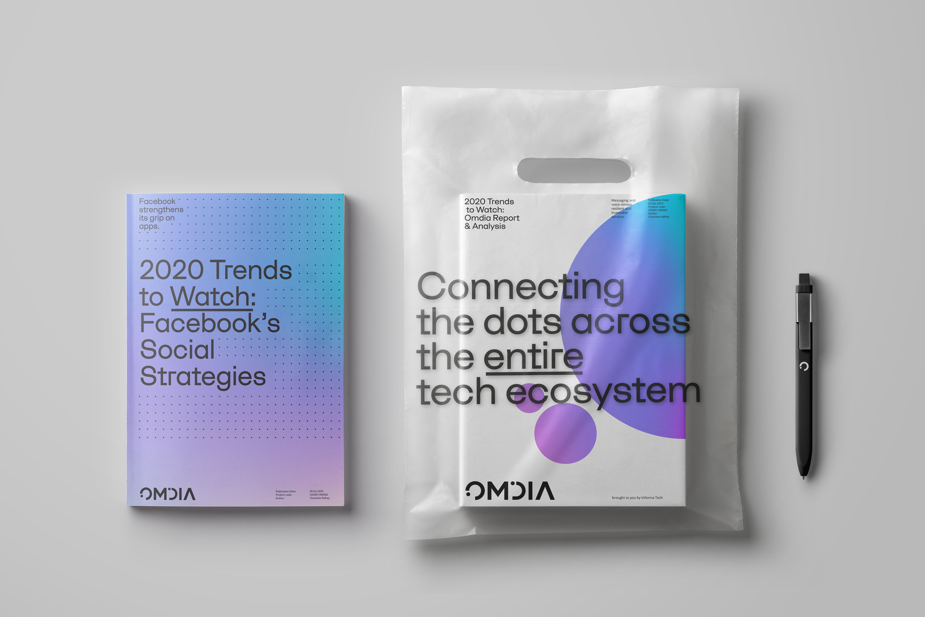
By "connecting the dots" across the entire tech ecosystem, Omdia helps businesses make better technology choices.
客户:Omdia(Informa集团)
地点:英国伦敦
范畴:消费者研究、品牌策略、命名、视觉识别系统、品牌指导手册
时间:2019-2020年
类型:团队项目
版权所有:BRU:D CREATIVE
角色:设计师
奖项:Transform Awards 金奖 (伦敦|2021年)
Omdia由Informa Tech旗下的市场分析公司Ovum、Heavy Reading、TracticaA与收购的IHS Markit合并而成。它拥有逾400名一流的分析师和咨询师,覆盖150个市场,每年收集3.95亿个数据点,出版3000多部研究报告。具备这样的研究广度和深度,通过“连接关键点”,Omdia能够有效地为整个科技生态圈的客户提供全方位研究和分析服务。
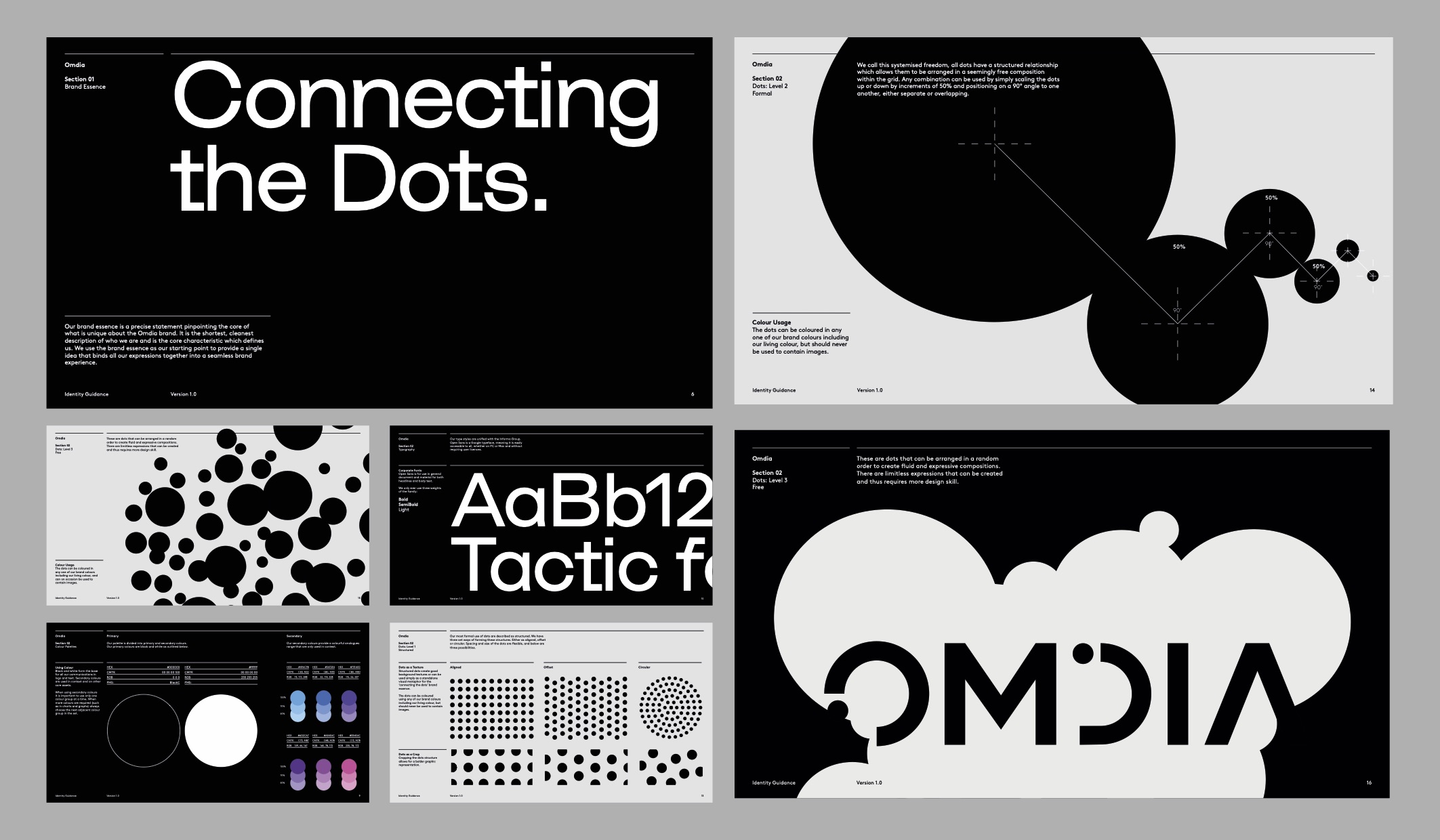
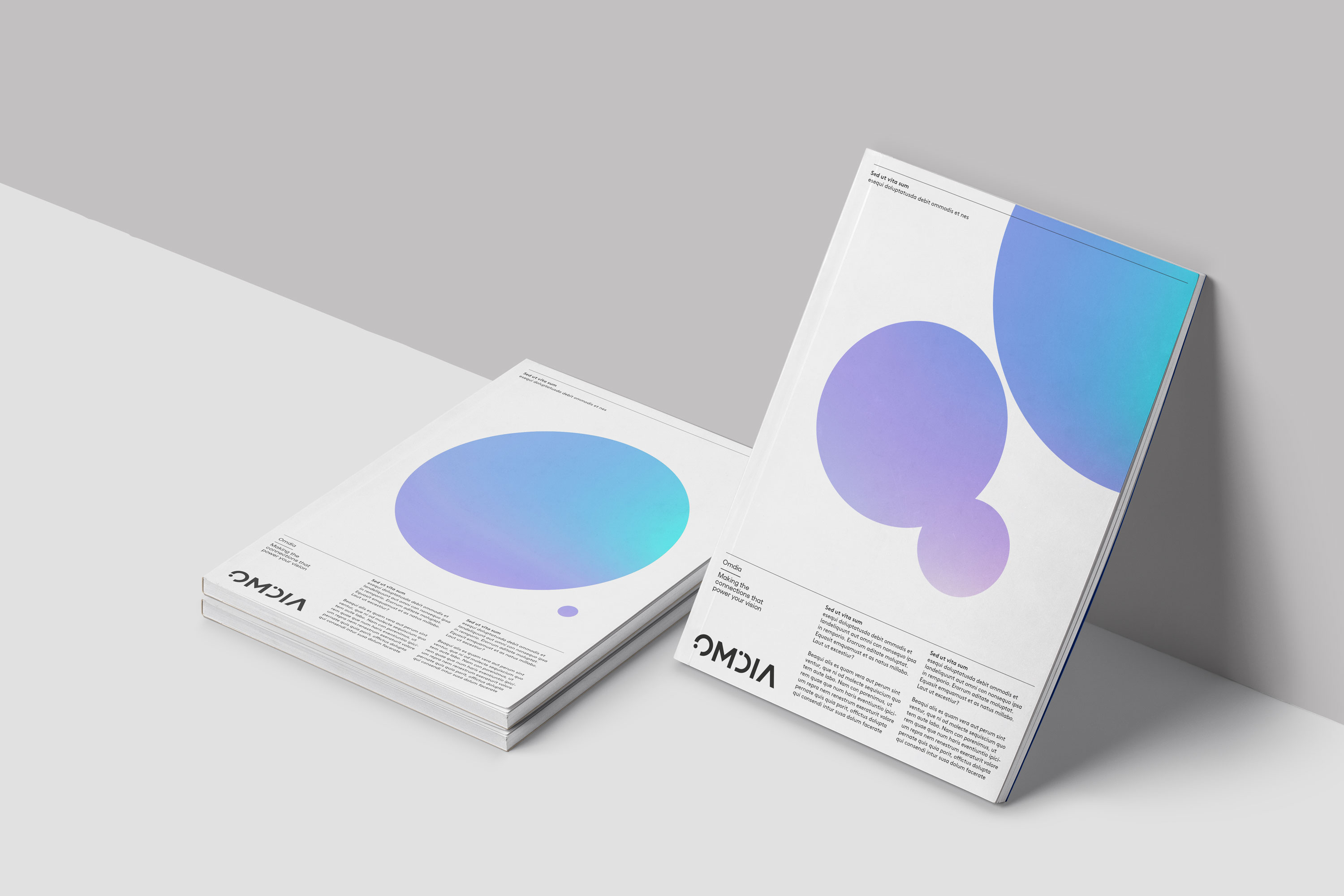
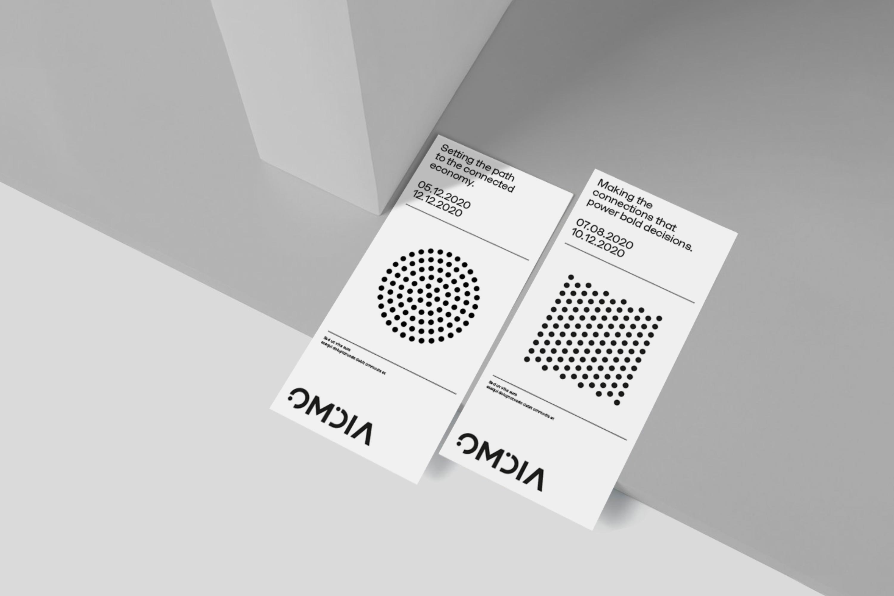
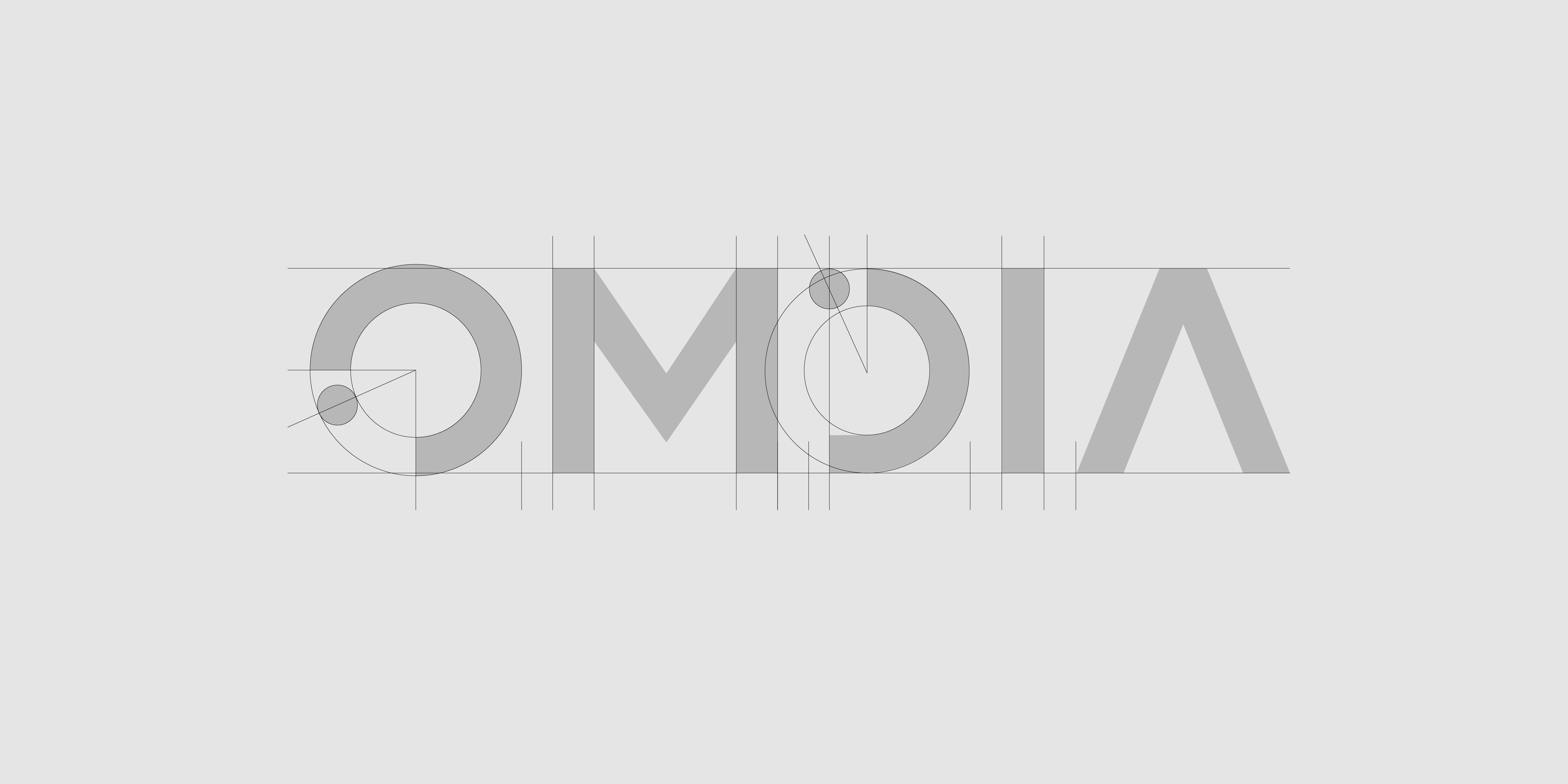
The visual identity was designed to break away from category norms and own the entire visual language of dots in a contemporary manner. Directly born from the strategic positioning, Omdia's visual identity demonstrates its integrated thinking and the ability to connect the dots across all aspects of technology data, insights and expertise.
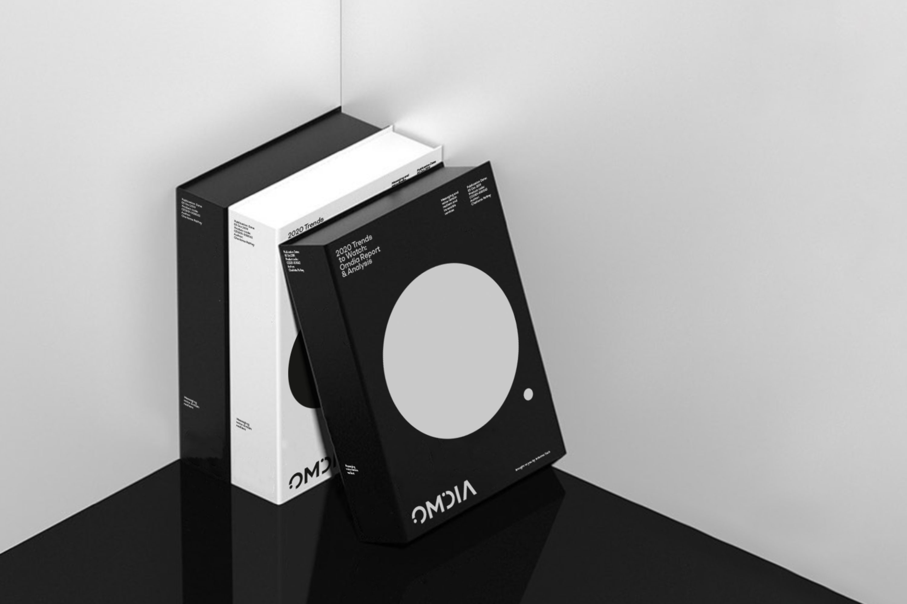
The colour palette is purposely focused on black and white to emphasise Omdia’s authority and assertiveness, and supported with a vibrant secondary palette to provide flexibility to inform or inspire audiences, depending on the need or occasion.
视觉设计旨在脱离其所处的科技门类的常规思路,并以现代的方式占有以圆点为基础的视觉语言。源于该品牌的战略定位,Omdia的视觉语言直接反映了它的整合思维以及将技术数据、洞察力和专业知识各个方面联结起来的能力。
品牌标准色的基本色是黑与白,以此强调Omdia的权威和自信;充满活力的辅助色可根据需要或场合,提供灵活性和视觉张力。